CASE STUDY
Eco Drive Visual Identity
& Environmental Branding.
Giving company culture a visible presence.
A visual language developed through Brande and applied across interior wall graphics, exhibition branding and vehicle wrap design.
AGENCY

PROJECT ROCKSTARS
Jenson Peter
CLIENT
Milkor
INDUSTRY
Aerospace
LOCATION
Abu Dhabi, UAE
THE CHALLENGE: MAKING BRAND VALUES VISIBLE
Eco Drive needed a visual language that could express its culture across several very different settings: the interiors used by students and staff, exhibition walls and a branded vehicle.
The challenge was to give the driving institute a consistent character while allowing each application to serve its audience. Inside the company, the graphics needed to communicate values and contribute to a more welcoming environment. At an exhibition, the same brand needed a clear and recognisable public presence.
MY ROLE IN THE ECO DRIVE BRANDING PROJECTS
Working through Brande, I developed the visual language and directed its application across environmental graphics, exhibition walls and the car wrap. My contribution connected the company’s values with the visual decisions, keeping the different projects aligned with a shared brand direction.
VISUAL COMMUNICATION STRATEGY
Make the culture visible in the places people use every day. Carry the same character into the places where new audiences meet the brand.
Environmental branding for students and staff
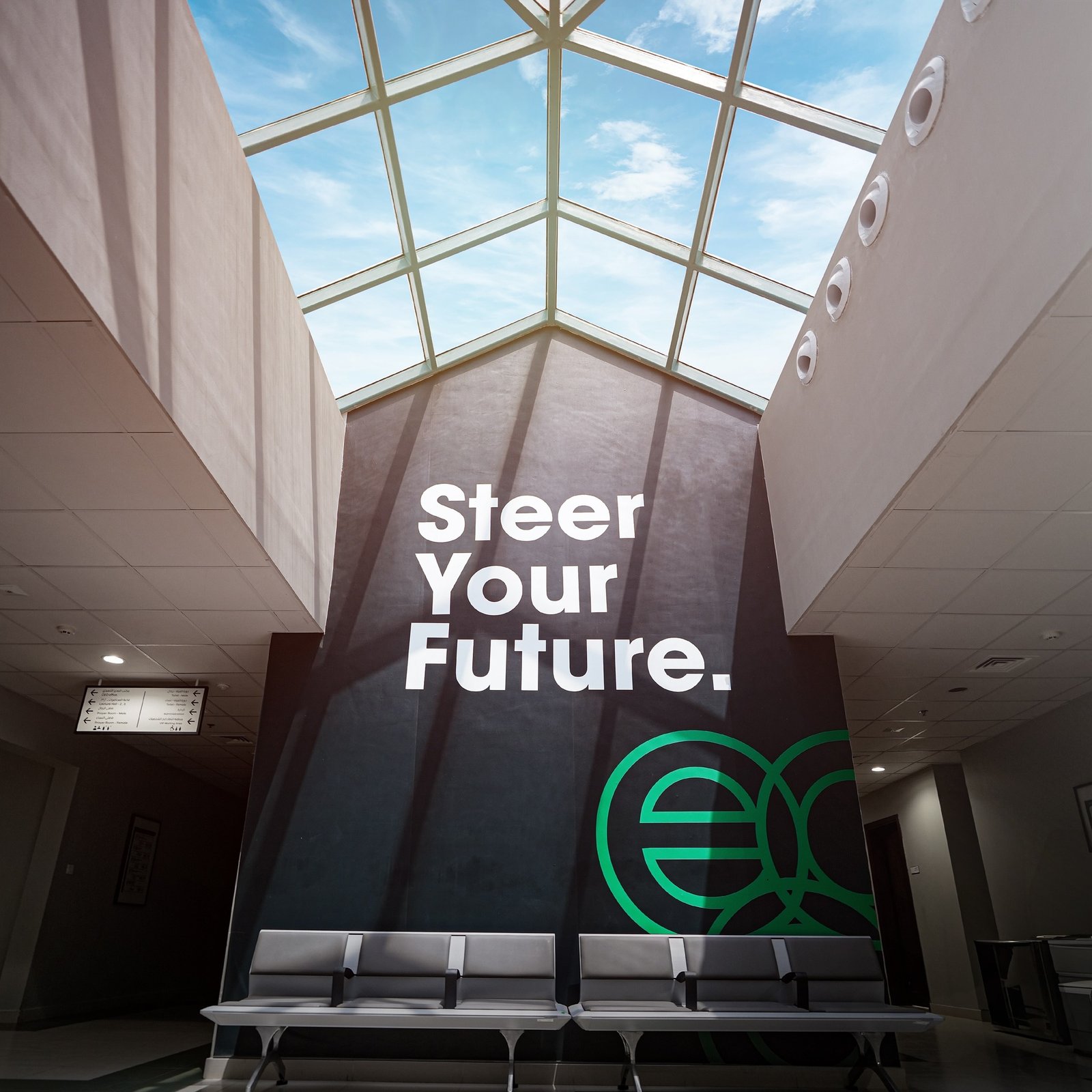
A driving institute’s interior is part of its daily brand experience. Students encounter it while learning. Staff work within it. The wall graphics needed to speak to both audiences and bring Eco Drive’s values into their shared surroundings.
I shaped the environmental branding around that purpose, translating the company’s culture into messages and visual elements designed for the space. The intention was to make the environment feel more approachable and give the values a visible role in everyday life.
Interior wall graphics with a communication role
The walls became a place to express what Eco Drive stood for. The visual language connected cultural messages with the identity, giving the interior graphics a recognisable relationship to the wider brand.
The audience response we aimed for was familiarity and a sense of welcome. Consistent visual cues were intended to make the surroundings feel connected and considered, while keeping the messages easy to notice and understand.


VEHICLE BRANDING &
CAR WRAP DESIGN
The Same Brand.
A Different Surface.
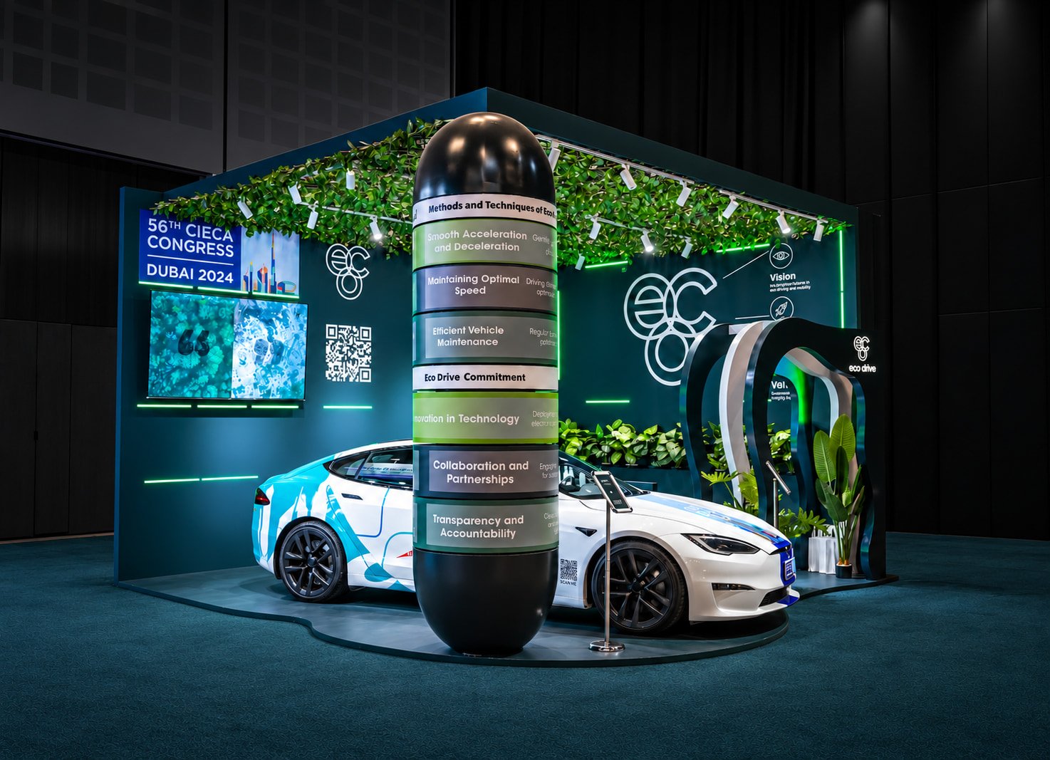
The visual language was also applied to a vehicle displayed at the exhibition. Car wrap design brought a different challenge: the graphics needed to work around the proportions and contours of the vehicle while keeping Eco Drive identifiable.
I directed the adaptation of the visual elements to the car, connecting it with the exhibition walls and the wider identity system. The repeated linework and graphic elements helped establish continuity between the vehicle and its surroundings.
A CONNECTED EXHIBITION PRESENCE
INFORMATION DESIGN FOR A FASTER SCAN
The exhibition application brought the visual language onto booth walls and the branded car. These surfaces needed to feel connected, presenting Eco Drive as one recognisable company.
My contribution focused on the visual communication across those applications: adapting the identity to larger surfaces and keeping the relationship between graphics, messaging and the brand clear.
RECOGNITION ACROSS DIFFERENT ENCOUNTERS
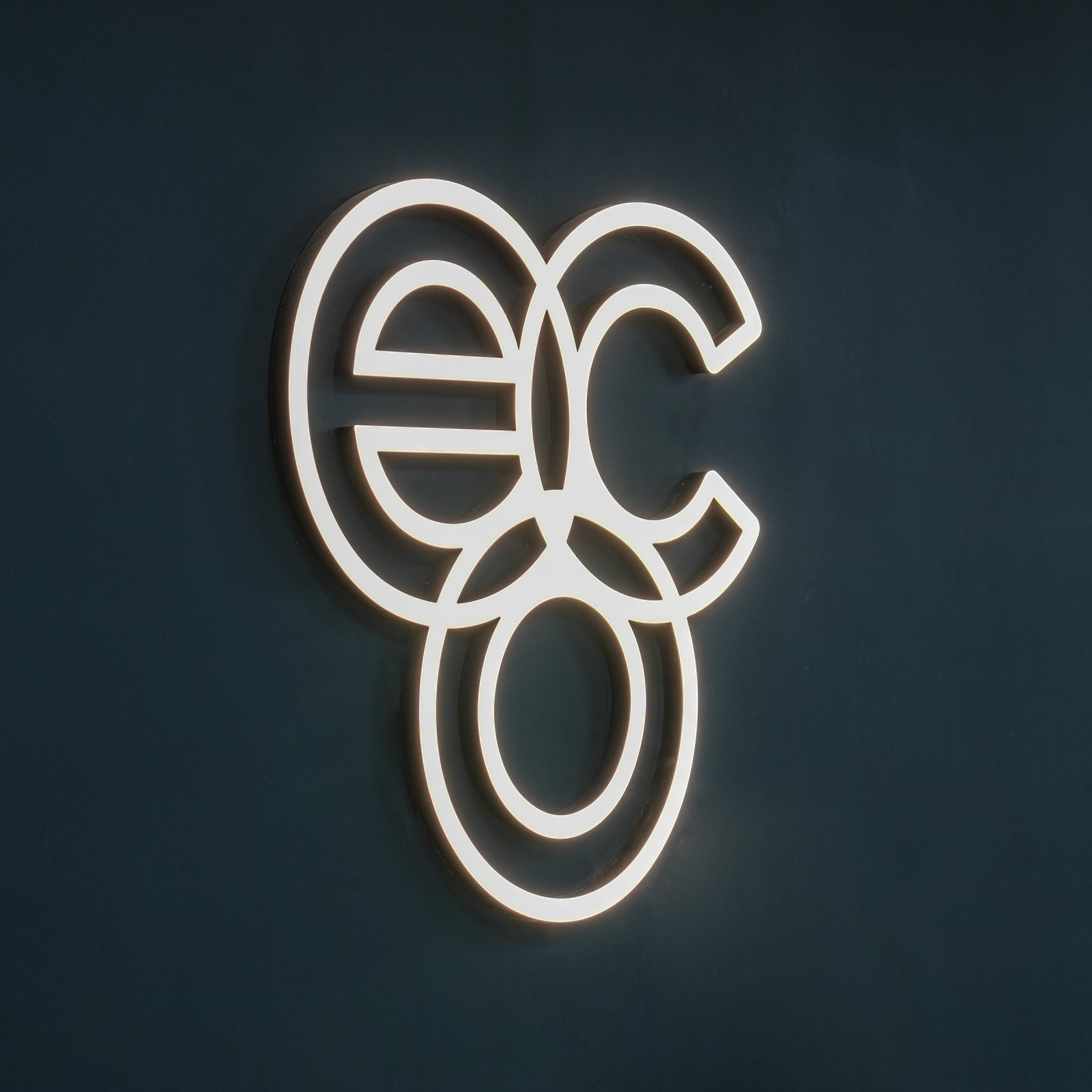
The public-facing work extended the same character developed for Eco Drive’s environments. Recurring graphic elements provided a connection between the interior language, exhibition walls and vehicle wrap.
The purpose was to give audiences familiar visual signals across different encounters. Students, staff and exhibition visitors could meet the brand in different contexts while experiencing a coherent identity.
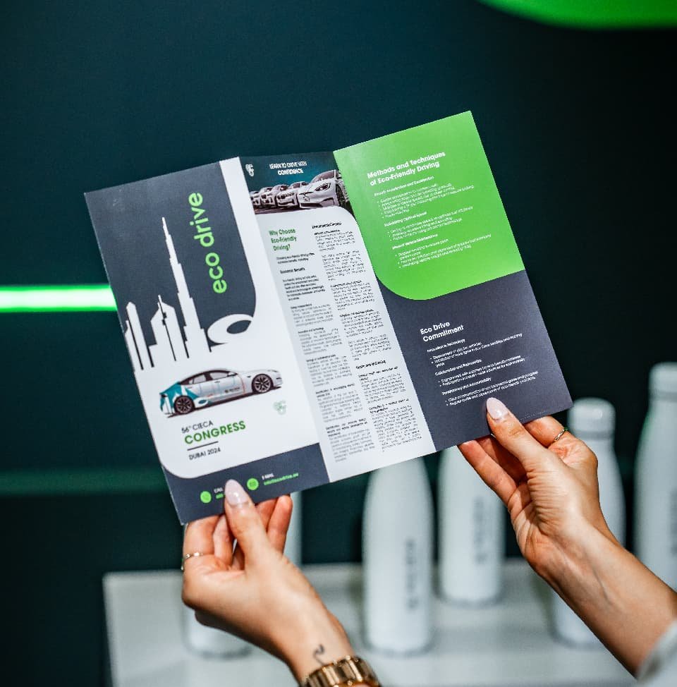
VEHICLE BRANDING &
CAR WRAP DESIGN
The Eco Drive projects connected visual identity development with environmental branding, interior wall graphics, exhibition applications and vehicle wrap design.
Delivered through Brande, the work demonstrates my contribution as a creative director: translating company values into a visual language and guiding how that language works across physical brand experiences.
BRAND COMMUNICATION BEYOND THE LOGO
For Eco Drive, the brand had to work on the walls students and staff saw each day, across an exhibition environment and on the surface of a vehicle. The common thread was a clear visual direction adapted to how people would encounter it.
I work with businesses and branding agencies in Dubai and across the UAE to shape visual communication and direct its application across identities, environments and brand experiences.
The delivered work
Multiple Projects.
One Recognisable Character.
REQUEST A CALL BACK
Your brand needs a clearer direction?
Tell me where the business is going. I will call you to talk it through.