

CASE STUDY

Milkor Aerospace & Defence
Branding Case Study.
An exhibition ends. Recognition should continue.
Brand strategy, visual communication and technical brochure design built around a brief encounter and a lasting association with Milkor.
AGENCY

PROJECT ROCKSTARS
Jenson Peter
CLIENT
Milkor
INDUSTRY
Aerospace
LOCATION
Abu Dhabi, UAE
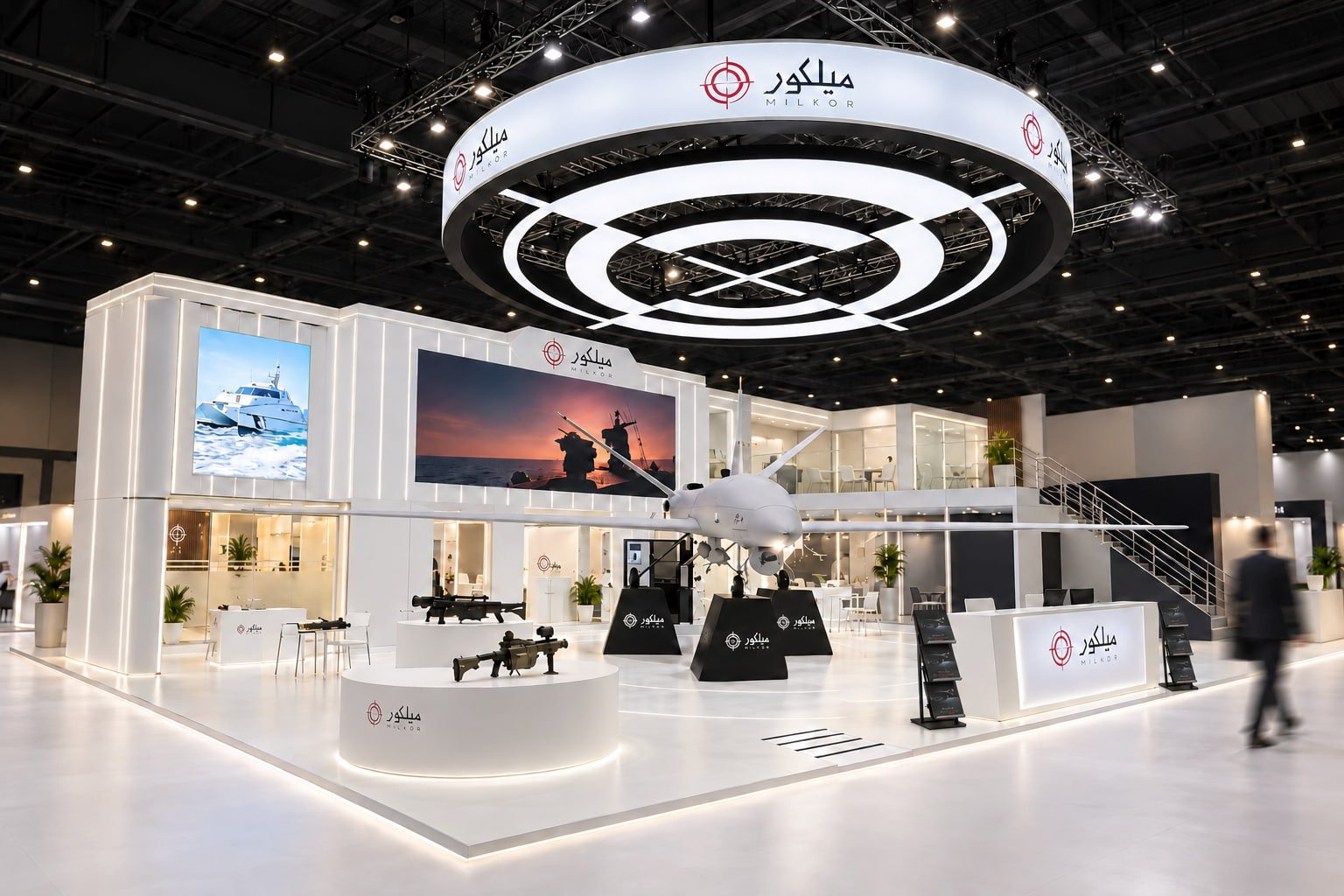
Milkor, an aerospace and defence company in Abu Dhabi, UAE, had products that gave exhibition visitors a reason to stop. The branding challenge was to turn that attention into a clear understanding of its capabilities and a name visitors would recognise again.
At international exhibitions, visitors have limited time to explore a stand, scan a product catalogue and evaluate technical specifications. Milkor’s visual communication needed to make relevant products easy to identify and essential information easy to absorb during that short window.
The second challenge came after the event. A Milkor brochure would sit among materials collected from other companies. A follow-up message might arrive days later. The brand identity needed to reconnect those encounters, bringing the company, its products and the earlier conversation back to mind.

BRAND STRATEGY FOR EXHIBITION COMMUNICATION
Make the capability clear while the visitor is there. Make the company recognisable when the visitor has moved on.
Audience strategy for aerospace & defence
professionals, government representatives, technical specialists and potential partners. The brand needed to signal that Milkor was relevant to their interests before they committed time to exploring the details.
That called for a layered communication strategy: a clear overview of the business, an accessible introduction to its product range and technical detail for visitors evaluating a specific capability. The priorities were relevance, clarity and credibility.
The psychology of attention & recognition
A crowded exhibition puts every brand in competition for attention. For this project, the psychological objective was practical: make the information easier to process and give the audience distinctive visual cues to recognise later.
Information hierarchy would guide the first scan. Consistent product presentation would support comparison. Repeated brand elements would connect the brochure, stand encounter and future marketing materials. The design direction centred on clarity, relevance and a recognisable impression.
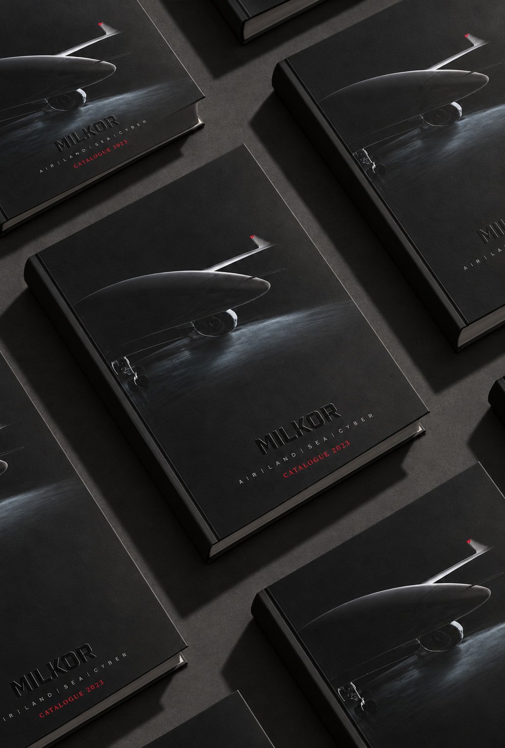
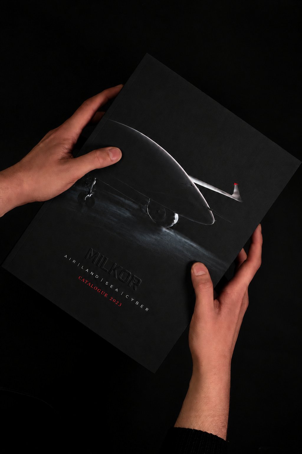
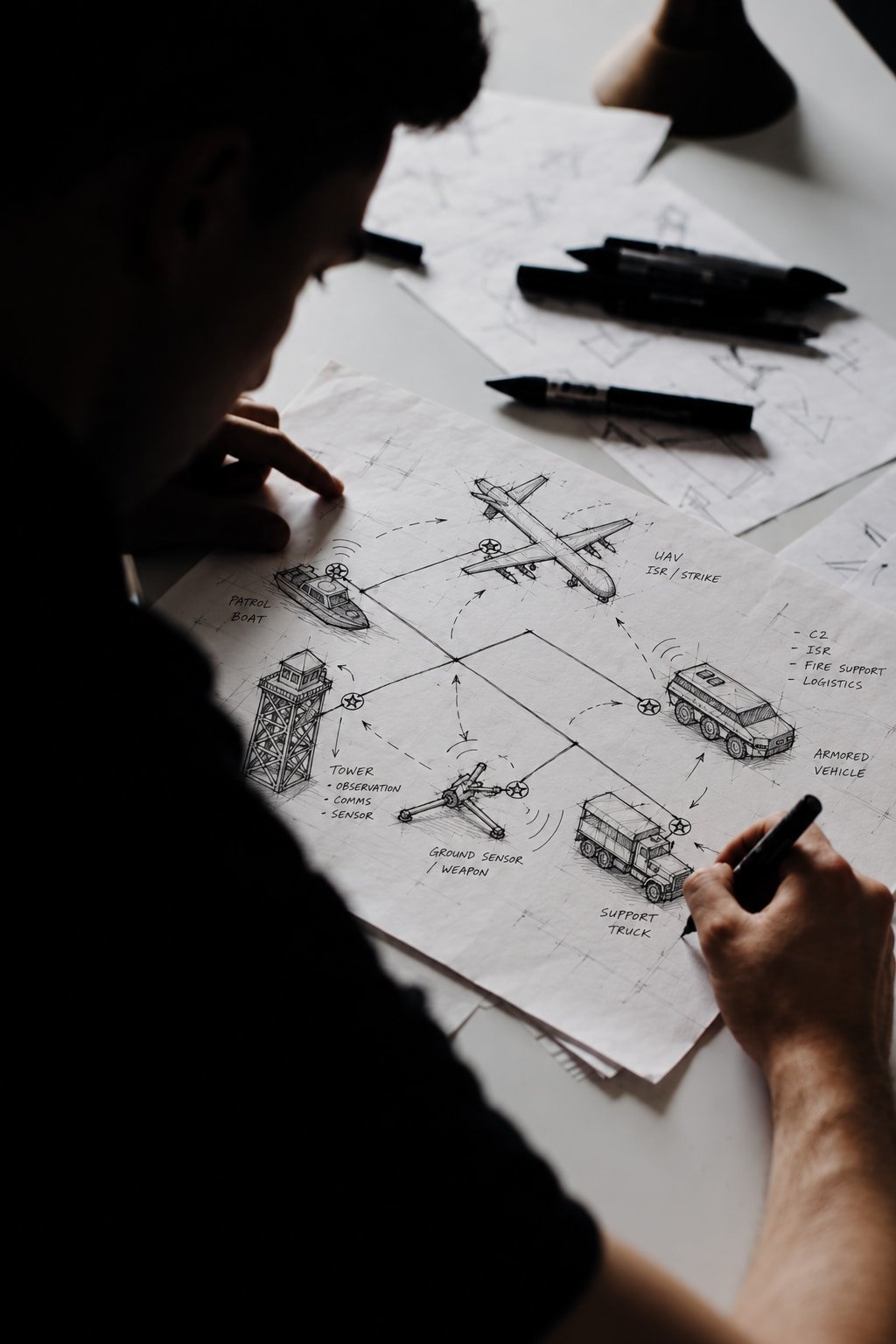
VISUAL COMMUNICATION & BROCHURE DESIGN
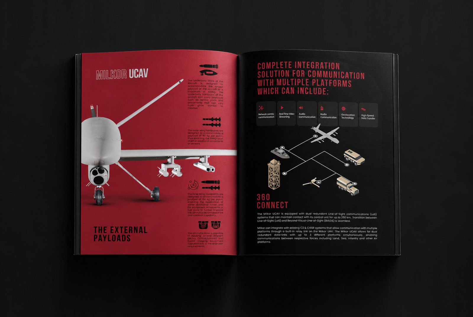
Technical Brochure Design
That Respects the Visitor’s Time.
EXHIBITION BRANDING & BRAND RECOGNITION
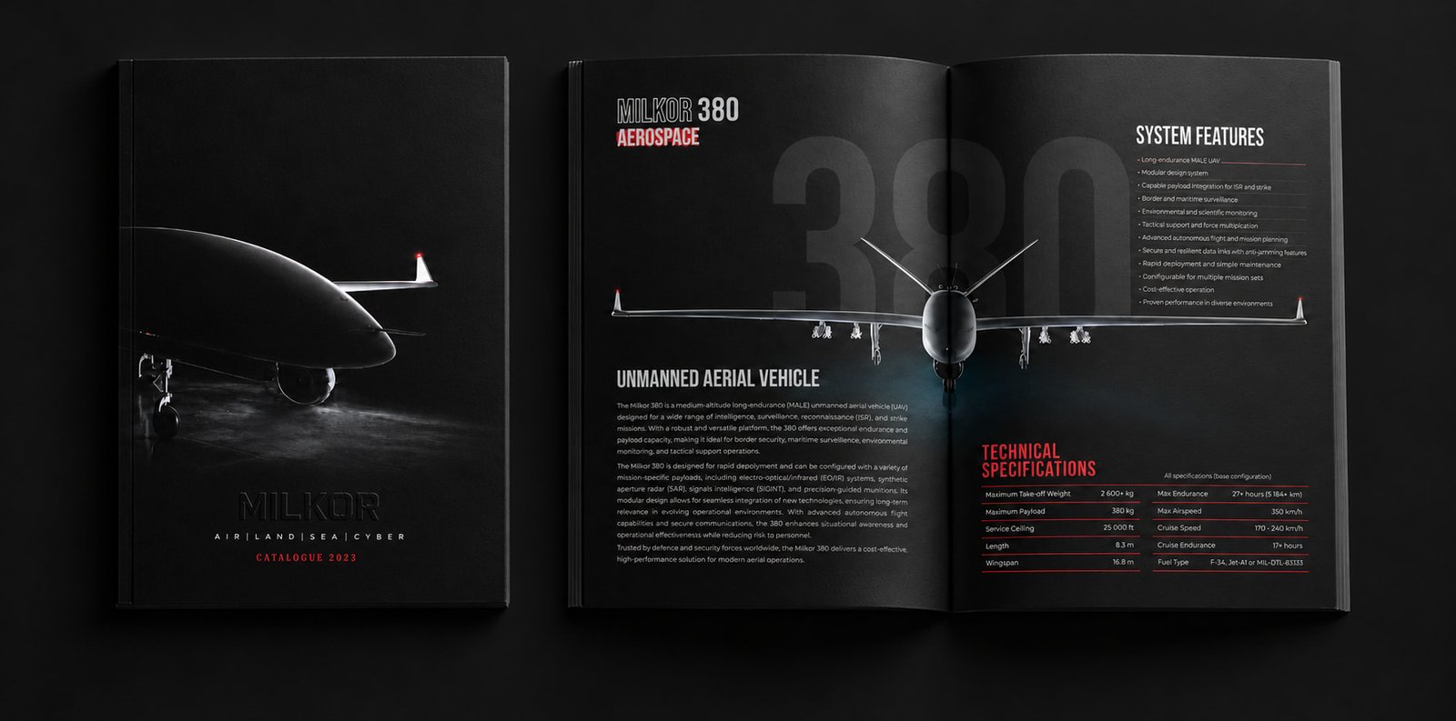
INFORMATION DESIGN FOR A FASTER SCAN
The brochure needed to work at two speeds: a quick scan during a booth visit and a detailed review after the exhibition.
Clear product groupings, prominent headings and organised technical specifications were priorities for the communication. The aim was to help visitors identify the right product, understand its role and find the details that warranted a further conversation.
A VISUAL IDENTITY VISITORS COULD RECONNECT WITH
The brand had to travel with the brochure. A distinctive visual language would create an association between Milkor’s products, its materials and the exhibition encounter.
Consistent typography, imagery and layout were intended to carry that association into later marketing communications.
When a visitor opened the catalogue again or received a follow-up, the materials needed to feel connected to the company they had met.
The website interface extended the same brand direction, supporting continuity from the exhibition to digital exploration.
BRAND IDENTITY & COMMUNICATION OUTCOMES
A Brief Encounter.
A Brand Worth Remembering.
REQUEST A CALL BACK
Your brand needs a clearer direction?
Tell me where the business is going. I will call you to talk it through.

