CLIENT
Cookie Conspiracy
INDUSTRY
F&B
LOCATION
Dubai, UAE
Cookie Conspiracy is an artisanal New York style gourmet cookie brand, offering weekly limited-edition collections and a core collection of cookie boxes. The project called for branding and packaging with a conspiracy edge, aiming to position Cookie Conspiracy as a premium and exclusive brand. The challenge was to strike the balance between luxury and conspiracy-inspired branding, crafting an identity that sparks curiosity.
RESEARCH AND INSIGHTS
We conducted extensive research to understand the market dynamics, competitive landscape, and preferences of high-income individuals in Dubai, UAE. This involved analyzing luxury food brands, customer behavior, and trends in gourmet cookies and premium packaging.
TARGET AUDIENCE
The target audience comprised high-income individuals living in Dubai, UAE, who appreciate gourmet products and are intrigued by unique, exclusive experiences.
POSITIONING & MESSAGING
We positioned Cookie Conspiracy as a premium, artisanal brand offering exclusive and intriguing cookie experiences. The key message emphasized the brand’s commitment to quality, exclusivity, and curiosity: “Indulge in the Mystery of Gourmet Excellence.”

BRAND CONCEPT
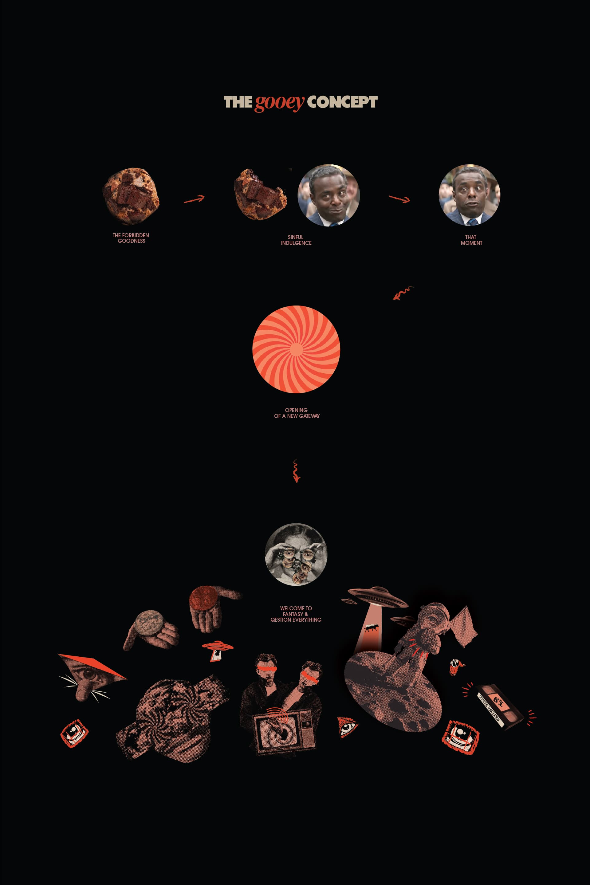
The creative concept centered around the themes of luxury, exclusivity, and mystery. We aimed to convey these values through a conspiracy-inspired, retro visual identity that stands out in the gourmet market


IMPLEMENTATION FRAMEWORK
BRAND VISUAL IDENTITY ELEMENTS
We developed a comprehensive set of brand elements
Brand Mark Design:
A sophisticated, modern logo with a mysterious edge, incorporating subtle conspiracy motifs.
Color Palette:
A luxurious color scheme featuring deep blues, golds, and vintage hues inspired by 60s/70s newspapers and posters.
Typography:
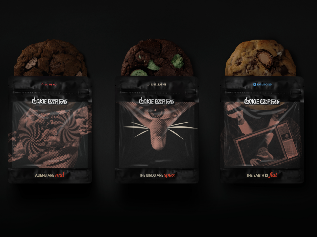
PElegant, retro-style fonts that ensure readability and evoke a sense of vintage intrigue. Imagery: Halftone retro-style cutout collage images to give a conspiracy twist, showcasing the brand’s uniqueness.
Imagery: Tailored illustrations and digital visuals designed to enhance the brand’s identity and foster an emotional connection with its audience.
VISUAL AND VERBAL IDENTITY
The visual identity was designed to be intriguing and luxurious, reflecting the brand’s commitment to quality and exclusivity. Consistent use of colors, fonts, and imagery was outlined in detailed brand guidelines. The verbal identity adopted a tone of voice that was confident, mysterious, and engaging.
IMPLEMENTATION
The branding and packaging were implemented across various touchpoints to ensure a cohesive and impactful presence. This included:
Packaging Design: Creation of a giant mysterious box for packaging, featuring a brightly colored eye on the cover to spark curiosity. Inside the box, the brand mascot inspired by the first moon landing conspiracy was revealed, along with branded cards and a stack of 12 cookies in distinctive matte pouches.
Collaterals: Updated brochures, business cards, stationery, and corporate signage.


BRAND SUCCESS METRICS
We kicked off the Cookie Conspiracy branding project by delving deep into market research to uncover the dynamics of the gourmet cookie industry, identify competitors, and understand the nuanced preferences of our target audience. This comprehensive discovery process included stakeholder interviews, taste-test feedback, and analyzing emerging trends in artisanal dessert branding, ensuring we had a clear roadmap for crafting a unique and impactful brand identity.
BUSINESS OUTCOMES
REBRANDING RESULTS
The success of the rebranding was measured through various key performance indicators (KPIs):
Brand Recognition:
Significant increase in brand recognition and positive perception among target audiences.
Engagement:
Higher engagement rates on digital platforms and increased inquiries and orders.
Customer Satisfaction:
Positive feedback from customers and an increase in repeat purchases and referrals.
OUTCOMES
The rebranding successfully rejuvenated Imtiaz Developers’ image, positioning the company as a leader in the real estate market. The refreshed brand identity resonated well with the target audience and strengthened the company’s market position


